Vol. 158 / No. 1362
Burlington Contemporary is the Burlington Magazine’s free online platform for reviews and research on international contemporary art.

Want to continue reading? Get 1 month digital access for only .
Subscribe now
Vol. 158 / No. 1362
by MARTIN BUTLIN
Accident and design have joined together in creating one of the most fascinating of recent exhibitions of the works of J.M.W. Turner, one that reveals a whole new aspect of his vision. The repeated demands of large, prestigious Turner exhibitions, combined with the relatively restricted space of the Hôtel de Caumont, Aix-en-Provence, the new exhibition centre that opened last year, has led to Ian Warrell producing a fascinating exhibition, Turner et la Couleur (to 18th September), covering all Turner’s career but with a relatively new selection of works and an important new group of sketches.1
There are few Venetian paintings or standard masterpieces, although Frosty Morning (cat. no.16) and, essential to the exhibition, the two Goethe’s Theory pictures (nos.115–16) are included. In compensation there are, among early works, the rarely seen Kilgarren Castle (no.4) and Lowther Castle (no.17; recently accepted by the State in lieu of tax and allocated to the Bowes Museum, here transformed by conservation treatment), Bonneville, Savoy, with Mont Blanc from Dallas (no.6), together with a number of finished watercolours from northern English regional galleries and a new selection of unfinished watercolours or sketches from the Turner Bequest. There is a rich display of studies of birds and fish (nos.19–21 and 118–19) and a sketchbook of pornography shown in a sequence of reproductions in a showcase (no.117).
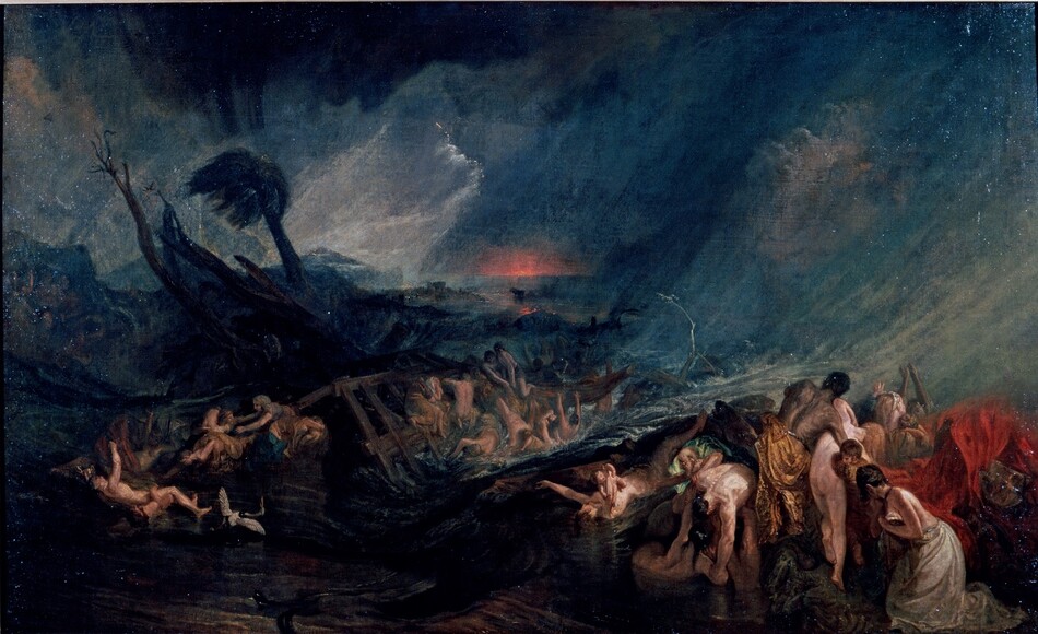
In France one is hardly surprised to find references to Turner as anticipating and in part helping to bring about the Impressionist movement, here indicated by a quotation in the catalogue from a letter written by Matisse to Raymond Escholier in 1898: ‘J’ai fait le voyage spécialement pour voir les Turner. Il me semblait que Turner devait être le passage entre la tradition et l’impressionnisme. J’ai trouvé, en effet, une grande parenté de construction par la couleur dans les aquarelles de Turner et les tableaux de Claude Monet’ (catalogue, p.91). The preface by Bruno Monnier, President of Culturespaces, on behalf of the Hôtel de Caumont, adds the names of Cézanne and a number of more recent artists (p.9). The inclusion of Cézanne, no doubt a tribute to the local artist, is justified by the inclusion of Turner’s The Flood (no.7; Fig.60), the only really large work in the exhibition, with its perhaps superficial resemblance to some of Cézanne’s early subject pictures and, of course, its challenge to the work of the same subject by Nicolas Poussin. However, Warrell has reunited a number of works in gouache on grey or pale buff paper from among a group of works previously lumped together with similar gouaches on tinted paper designed for engravings, starting with the French Rivers series in the 1820s (see especially nos.78, 82, 94 and 97). With one notable exception, only a few single examples have hitherto been exhibited, so that only now does one understand the full force of the group as a whole. When, in 1975, Andrew Wilton assembled a group of these works they were associated with Turner’s journey to Rome in 1829.2
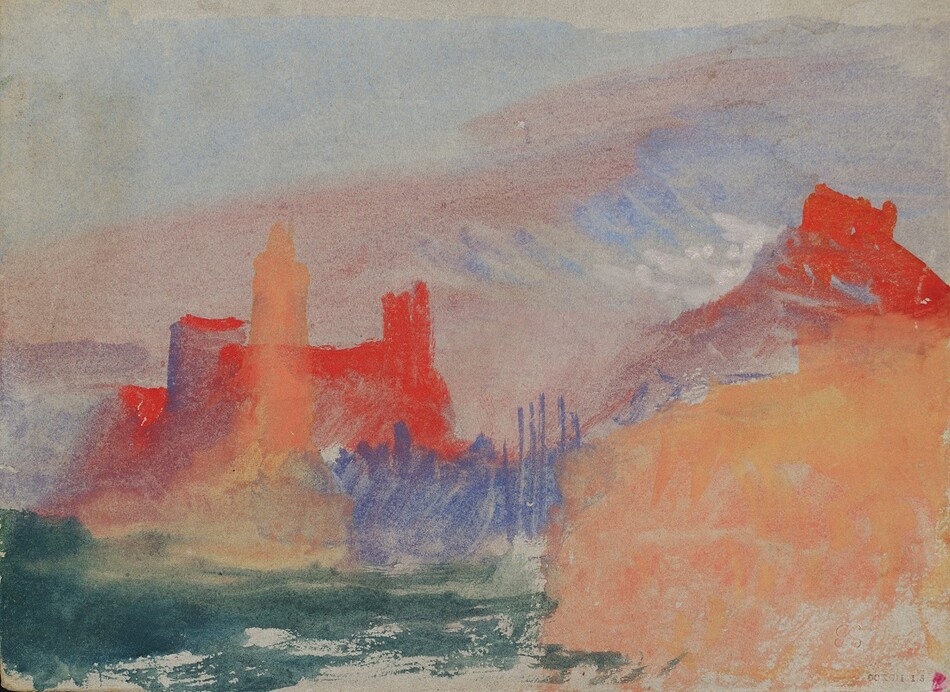
Over the last few years research has revealed that Turner travelled along the coast from Marseille to Genoa, both in 1828, on his way to Rome, and in 1838.3 This was an alternative to the classic route to Italy via Switzerland and the Alps. The finer details of these journeys, and the likelihood that Turner travelled along this route in both directions, are still unclear (p.95). What is clear, however, is that it was not until 1838 that Turner started to use excitingly bold, unmodulated reds and their complementary blues, together with a simplified approach to the shapes of buildings and natural forms. This new rich colouring, here inspired by the particular light of this part of the Mediterranean coast, is found in later works, in a rather more modulated form, in some of the gouaches made in Germany and Venice in 1839 and the early 1840s.
One reason for dating this group of works to 1838 rather than to 1828 is the fact that they show Turner in full possession of the possibilities of this new technique of gouache on coloured paper. Another is in his use of new materials, a subject that has only recently begun to appear in Turner catalogues and is here treated by Joyce Townsend, partly using the work of Peter Bower (pp.51–53). The subject of colour is further discussed in essays by Alexandra Loske, Nicola Moorby, Roland Courtot and Ian Warrell. This new group of works means that one can now see Turner as anticipating the Fauves, as in The Vermilion Towers: Study at Marseille (no.97; Fig.59). This makes Aix a particularly appropriate place for displaying works that illustrate Turner’s new and extreme attitude to colour, since there is a fine display of Fauve pictures some 85 kilometres east at Saint-Tropez in the Annonciade Museum.
Margate, where this exhibition will later be shown, has a special section to itself (pp.149–50). Margate, or rather the Isle of Thanet, was praised by Turner as having the most beautiful skies in Europe, and they are well represented, standing in contrast to the boldness of the Mediterranean gouaches in their subtlety and relatively restrained manner. Even here, however, one comes across odd patches of undiluted red, as in a sea piece, nearly monochrome save for a red splash with suggestions of a buoy (no.127), echoing the famous case of Helvoetsluys of 1832, and in the isolated strokes of red in Fire at Sea (no.140). Here again one looks forward to finding a particular resonance in the local conditions of light, such as that which distinguishes the Mediterranean coast of France. Standing in for the presumably unavailable oil painting is Robert Carrick’s chromolithograph of Rockets and Blue Lights exhibited in 1840 and now at Williamstown (no.120); Turner would have been fascinated by this example of new technology.
Not surprisingly, colour permeates this exhibition, save in Turner’s earliest works, where effects of light make do (see especially nos.2, 5 and 6). The paradox of Turner’s career is also stressed, his reliance on engravings to widen his appeal to the public and the care with which he chose his engravers; monochromatic engravings are given a room of their own and an essay by Nicola Moorby (p.55). Again, Turner pushes his art to its extreme in the rich blacks of works from the ‘Little Liber’ of about 1825 (nos.53–54). Also included is Turner’s tribute to Girtin, the engraving of 1823 by Thomas Lupton after Girtin’s White House that Turner supervised (no.47).
The catalogue, eschewing details of provenance and authenticity, consists of eleven essays in seven sections. The splendid colour illustrations include a number of striking details. The volume is interspersed with seven quotations such as that already quoted by Matisse; others are by contemporary critics and later French authors such as Thoré. There is a description, also illustrated on the wall, of how Turner transformed the setting of Mercury and Argus, first exhibited in 1836 and again in 1840, by adding the Lantern at Genoa so that a landscape based on Cromarty in Scotland became a scene in Italy (pp.109–10). There are some signs of haste in the catalogue, as also on the labels.
Two works struck this reviewer as odd when seen across the room. Off the Nore (no.143) is one of the group of small canvases, many badly damaged, associated with John Pound, Mrs Booth’s son by her first marriage, which now seems to be achieving general acceptance.4 The scratchy handling of the waves looks mean and superficial but finds parallels in some of Turner’s late watercolours. The links between John Pound and the other painting, traditionally known as The Phantom Ship (no.122) but now identified as showing the beach at Margate, are slender, at least as set out in the catalogue, and the picture is worrying in its general colouring and in the contrast between the stronger forms and out-of-scale size of the large ghostly ship and the rest of the painting.5 This could be the result of a complete change of mind on the part of the artist. Comparison between the illustration in Butlin and Joll and that in the new catalogue suggests that some changes have occurred; it would be interesting to see any records of reworking made at the time of the painting’s conservation. To sum up, not the greatest of Turner exhibitions, but one of the most stimulating and refreshing of recent years.
1. The exhibition will be shown at Turner Contemporary, Margate (8th October 2016 to 8th January 2017). Catalogue: Turner et la couleur. By Ian Warrell, with contributions by Alexandra Loske, Joyce Townsend, Nicola Moorby and Roland Courtot. 192 pp. incl. 160 col. + 17 b. & w. ills. (Hazan, Aix-en-Provence, 2016), €29. ISBN 978–2–75410–941–3.
2. A. Wilton: exh. cat. Turner in the British Museum: Drawings and Watercolours, London (British Museum) 1975, nos.149 and 152–58.
3. See the essays on ‘Turner en Provence’ and ‘La lumière de Gênes’ by Roland Courtot and Ian Warrell respectively in Warrell, op. cit. (note 1), pp.95–111.
4. M. Butlin and E. Joll: The Paintings of J.M.W. Turner, New Haven and London 1984 (2nd ed.), pp.290–91, no.476, as by Turner.
5. Ibid., p.319, no.556a, as not by Turner.